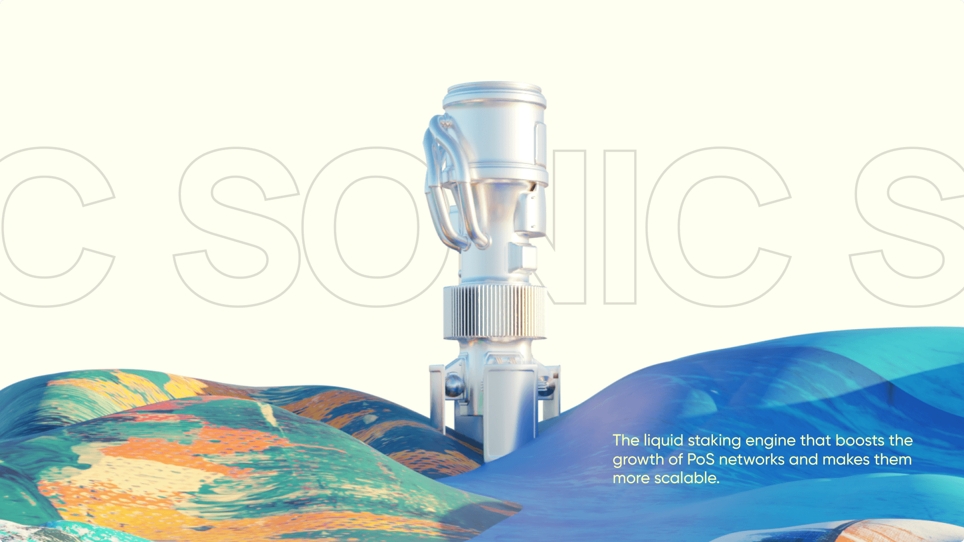
Sonic: Liquid Staking Engine
Designing a brand that moves with purpose—fluid, fast, and unmistakably Sonic.
The Sonic Identity: Designing a Brand That Moves
Some projects challenge your skills. Others shape who you are. Sonic was both.
When I took on the responsibility of designing Sonic’s brand, it wasn’t just about a logo or a color palette—it was about crafting a visual language that embodied movement, fluidity, and decentralization. A brand that didn’t just sit still but propelled forward, much like the liquid staking engine it represented.
I wasn’t alone in this. Rishav, our graphic designer, transformed my abstract ideas into tangible visuals. Mohak, our CEO, stood by every bold decision, giving me the creative freedom to push boundaries. Together, we set out to create something that felt alive.
The Dragonfly: A Logo in Motion
We started with a simple yet loaded question: What does Sonic look like?
The answer wasn’t just a wordmark. It was movement, speed, and connection. That’s when the dragonfly emerged—a symbol of agility, transformation, and seamless exchange. The two halved circles within the wordmark visually represent the fluid motion of tokens within the staking ecosystem. Every curve, every space was intentional.
It wasn’t just a logo; it was a philosophy of motion distilled into form.


A New Visual Language
Illustrations:
Sonic’s visuals were built on simple geometric shapes, but what made them unique was the texture layered over them. This texture wasn’t just an aesthetic choice—it symbolized the uniqueness of each staking transaction, reinforcing the idea that no two interactions on Sonic are the same.


Color Palette:
We ditched the usual dark, cyberpunk-heavy Web3 aesthetic. Instead, we chose cool, refreshing tones—a breath of fresh air in the ecosystem. Sonic was different, and it had to feel different.

Typography:
Hauora Sans became the brand’s voice—a neo-geometric sans that was clean, modern, and effortlessly readable. Its structure was both technical and human, reflecting Sonic’s balance of engineering precision and user-first simplicity.

The Process: Learning, Leading, and Taking Risks
This project wasn’t just about creating a brand. It was about taking ownership. For the first time, I wasn’t just executing—I was leading. I made the calls, set the direction, and trusted my instincts.
I also dove headfirst into new creative territories:
Designed my first-ever logo from scratch.
Explored interactive 3D modeling for product visuals.
Learned how to generate textures to add depth to illustrations.
Every challenge became a lesson. Every risk taken was backed by Mohak’s unwavering trust in creativity. And with Rishav’s executional brilliance, my vision found its perfect form.
The Takeaway: A Brand That Feels Alive
Sonic wasn’t just another liquid staking product—it was a vision brought to life through motion, clarity, and craft. We didn’t stop at the brand. We designed the entire app experience and built the website—pieces that received genuine appreciation for their uniqueness and polish.
But not every bold experiment finds its market. Sonic, despite its momentum, didn’t hit product-market fit. And that’s okay. Because what we built still mattered.
It redefined how I think about design—not just as a function, but as a living, breathing story that earns trust, sparks emotion, and invites belief. Sonic taught me that great design is never wasted—it becomes part of who you are, shaping the next thing you create.
👇 Down below, you’ll find a sneak peek of the app we designed—a glimpse into what could have been.


